views
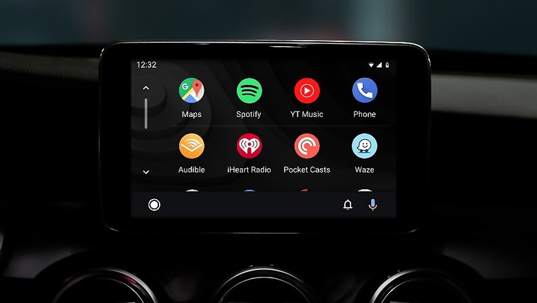
Google is rolling out a redesign for its driver assisting mobile app -- Android Auto -- with a default dark mode, colourful accents and readable fonts to the app which, the search-engine giant thinks, would fit better with modern automotive interiors.
"We're evolving Android Auto's design to fit in better with your car's interior. The new app interface is built to help you get on the road faster, show more useful information at a glance and simplify common tasks while driving," Rod Lopez, Product Manager, Android Auto, wrote in a blog post on Monday.

Launched in 2015, Google's Android Auto was made to mirror features from an Android device to a car's compatible in-dash information and entertainment head unit.
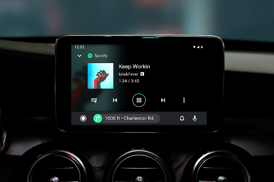
The redesign would allow users to see directions turn-by-turn even while they control other apps and would allow them to easily discover and start other apps compatible with Android Auto.

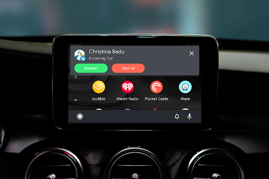
The new notification centre would display recent messages and calls at an accessible spot on the screen.
"If you have a car with a wider screen, 'Android Auto' now maximises your display to show you more information, like next-turn directions, playback controls and ongoing calls," Lopez added.


Comments
0 comment