views
Constructing The Gear
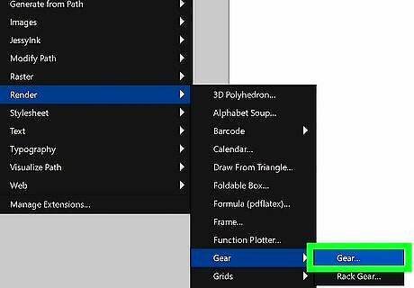
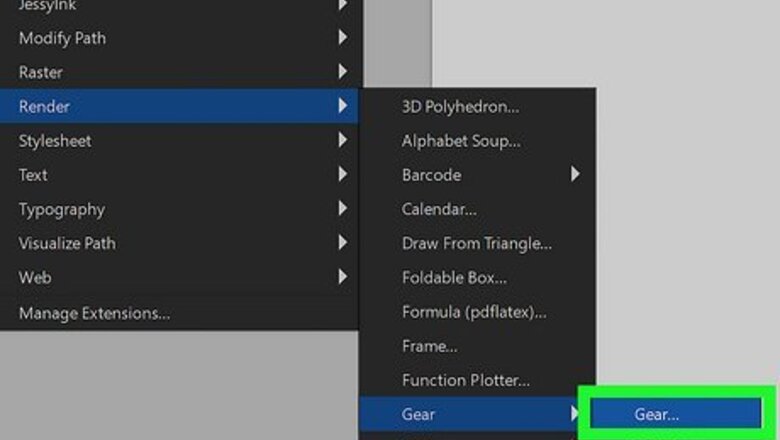
Start with the gears effect included in Inkscape. Visit the Extensions tab, then go to Render and then Gears. Adjust your gear's parameters in the pop-up window, and click "Apply" when done. Be sure to check the "Live Preview" box to see the effect of your parameter changes in real time. From this same tab, you may render a "rack gear" if your design calls for it. If you are content with the rendered gear, feel free to start customizing and coloring it as is!
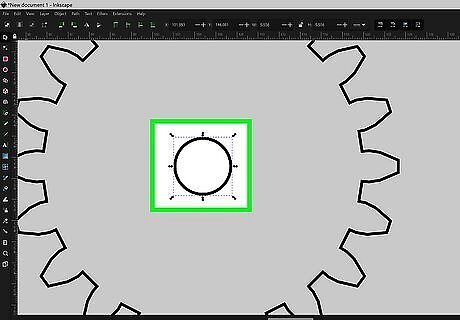
Add a circle within the rendered gear. Be sure to center the circle, and then group the two layers together.
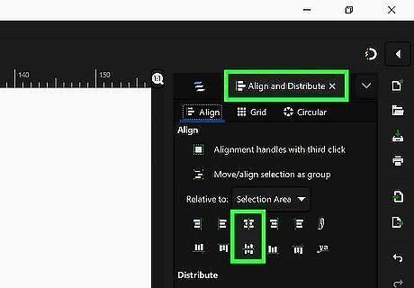
Use the "Align and Distribute" function to align your design to the center of the page. It can be found at the bottom of the Object drop-down menu.
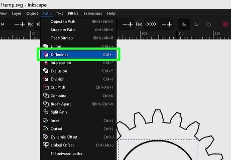
Subtract the circle from the wheel. Use the stroke function to subtract the inner circle from the rendered gear around it. You may need to ungroup so the program continues to recognize your inner circle as a separate entity to be subtracted.
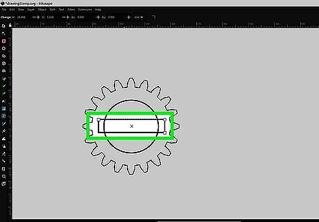
Add a rectangle and align it to the center. We can now begin adding our own spokes to the rendered gear. Add a rectangle to get started.
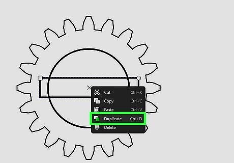
Duplicate the rectangle and rotate the duplicate 90°.
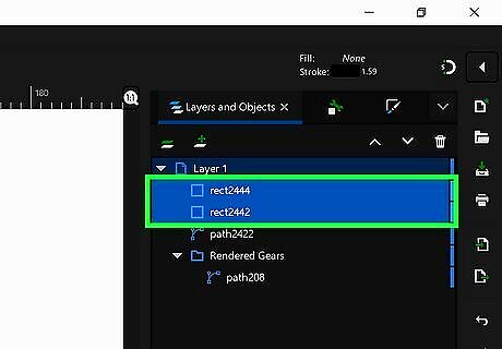
Select both rectangles and rotate them freely.
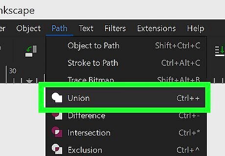
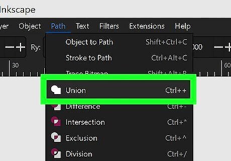
Select everything and do a union. The union tool will not work if your items are grouped together, so ensure everything is ungrouped before continuing.
Create a small circle in the middle of the gear. Align it to the center and do another union. Your first gear is done! The hole for the axis is another circle aligned to the center and subtracted from the wheel. Other gears coupled with this first one must have similar teeth, so use the Gear plugin and change only the number of teeth, or duplicate your first gear and adjust each copy accordingly. You may want to increase the complexity further by adding some parallel gears, which may have their own parameters (as long as they are not coupled with the initial gears).
Coloring The Gear
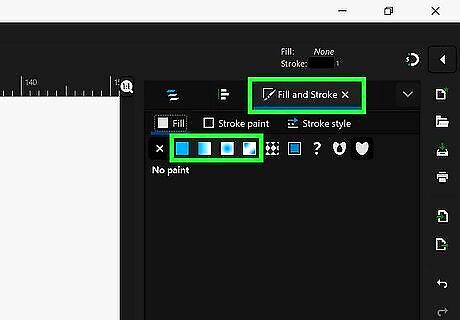
Define your intended color. Let's assume we want to color our gears a metallic shade of silver or gold. Of course, metallic is not a color. it is created by light reflection, so we need a multi-stop gradient (a gradient with more than two colors). A metallic gold should contain a succession of lighter and darker shades of yellow, and maybe also a bit of orange. A metallic bronze should be yellow with a shade of green (copper oxidation is green). A metallic steel should contains greys. A metallic chrome is also made up of more reflective shades of grey (more contrast, from almost black to almost white), while silver includes less reflective greys.
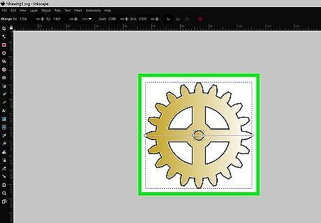
Take one gear and apply the gradient to it. For a 3D look, add a drop shadow by duplicating a gear, making it black, moving it a few pixels down and right under the initial gear, and adding a bit of blur.
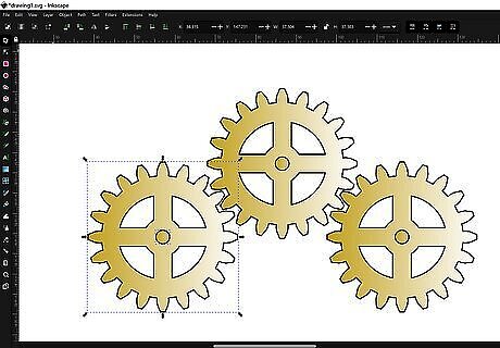
Apply your gradient(s) across all your gears. The colors should be largely uniform, but feel free to customize the design to your liking!
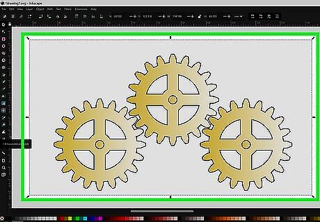
Add a background. Consider using another metallic gradient, likely one a bit darker than your gears. A drop shadow becomes especially crucial when trying to contrast your gears with the background.



Comments
0 comment