views
X
Research source
Discrete data, such as the average price of cars from year to year, would be a represented as single points on the graph. The calculation is made only once for each year thus the data is discrete. The x axis would denote each year and the y axis would represent the average cost of cars for each year. A line graph would be useful for representing continuous data where every possible value on the x axis has a corresponding value on the y axis. For instance you might want to chart temperatures over time. You can take the temperature at any time so the data is continuous. When trying to calculate slope area, minimum and maximum of a function it is very helpful to draw a graph.

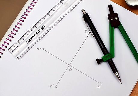
Draw the x axis. Make a horizontal line on the paper. You may draw arrows on the ends of the line to indicate it is a number line that continues past your data sample. Put the label "X" to the right of the line to indicate the x axis. Mark the center of the line with a vertical tick mark and label it 0. This is the origin of the graph. Make equally spaced tick marks on the rest of the x axis. For this example you should label the tick marks from 1 to 10 on the right side of the 0.

Draw the y axis. Make a vertical line that passes through the origin of the x axis. Put the label "Y" above the line. Make equally spaced tick marks on the y axis. For this example you should label the tick marks from 2 to 20 above the 0.

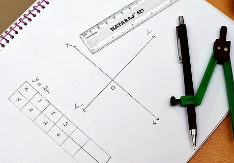
Calculate the values of y for several values of x. We will be drawing a graph using the function f(x) = 2x. This means that y = 2x. For every possible value on the x axis there will be a corresponding value on the y axis. To calculate the value of y, plug a number into x. If x= 3 then f(x) = 6. Only positive values will be used in this example. Set x = 0, 2, 4, 6, and 8. The corresponding y values are 0, 4, 8, 12, and 16. The result is a set of ordered pairs represented with the x, or abscissa, first and the y, or ordinate, second. For our example we will have five ordered pairs: (0,0), (2,4), (4,8), (6,12), and (8,16).

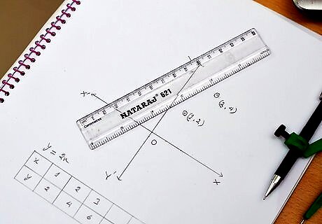
Mark the ordered pairs on the graph. Count over on the x axis then count up on the y axis. The value of y is marked on the graph above the x value.

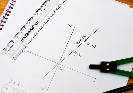
You have created a graph of the function f(x) = 2x. EXPERT TIP Joseph Meyer Joseph Meyer Math Teacher Joseph Meyer is a High School Math Teacher based in Pittsburgh, Pennsylvania. He is an educator at City Charter High School, where he has been teaching for over 7 years. Joseph is also the founder of Sandbox Math, an online learning community dedicated to helping students succeed in Algebra. His site is set apart by its focus on fostering genuine comprehension through step-by-step understanding (instead of just getting the correct final answer), enabling learners to identify and overcome misunderstandings and confidently take on any test they face. He received his MA in Physics from Case Western Reserve University and his BA in Physics from Baldwin Wallace University. Joseph Meyer Joseph Meyer Math Teacher Develop strong graphing skills. Drawing graphs by hand will help you develop foundational graphing skills, especially in understanding scales and axes. This will build a strong base for you to use helpful online tools to visualize complex relationships, perform calculations, and prepare for standardized tests.


Comments
0 comment