
views
Getting Started

Create a theme or focus. What is the primary topic of your magazine? Keep in mind that most magazines are niche publications that target a highly-specific audience (for instance, people who are interested in quilting or brides looking for wedding ideas). Ask yourself: Will this be a standalone publication or one in a series? If it’s part of a series, what’s your larger theme? Try to draw the title of your magazine out of this overarching theme. Note that most magazines have one- or two-word titles (such as TIME, National Geographic, Seventeen, Rolling Stone, and Forbes). Not only can a short title sum up your theme nicely, it's also easier to deal with from a design standpoint. What’s the focus of this one publication? How can you use it to tie all your content together? (It’s not for nothing that a single publication of a magazine is called an “issue.”) A good example of themed issues are the prom editions of teen magazines, or the Swimsuit Issue of Sports Illustrated. All of the content inside that issue ties back to the primary focus. What’s the title of this issue? If necessary, what’s the title of the entire series? Annual examples of titling an issue include the Swimsuit Issue of Sports Illustrated, the Hollywood Issue of Vanity Fair, and the September Issue of Vogue.

Decide how you will assemble your magazine. The method you choose for putting your magazine together can determine how you gather and incorporate content. Here are some points to consider: Though the glossy, software-enhanced look is a magazine standard, making one without the use of computers can give your magazine an art-house feel. However, this will require lots of extra time and talent and is best suited for people who have already done similar projects. InDesign is the standard (though expensive) designer tool for digitally-designed magazines. The type is often written out and edited in InCopy, which meshes with InDesign. Alternately, some publications use Quark. If these options aren’t in your price range, Office Publisher might be an effective alternative.
Establish a deadline. When do you plan to have the magazine finished? Ask yourself if you're setting reasonable expectations, and if you can feasibly have the magazine finished and in the hands of your readers by the deadline. A deadline is more important if you're dealing with topical issues (such as news or humor), or if you're building the issue around an annual event (such as fall fashion).
Creating Content
Write articles, columns and stories. What do you want to say to your readers? Whether your magazine is built around humorous anecdotes, arty fiction, news reports, high-brow interviews, or any combination or genres, you'll need textual content. Here are some possibilities to consider: Write articles about topics you or your collaborators care about. Do they tackle humanitarian issues? Are they related to current events? Do they offer advice or interview interesting people? Write short stories to give your magazine a more personal touch. These can be fiction or nonfiction depending on how they relate to your topic. Dig up old poems, or ask friends if you can publish their work in your magazine. These would give a magazine an artistic flair. Collaborating with friends to get different perspectives would be a great way to approach this aspect of the magazine.
Gather images. Even if your focus will be written content, magazines are a visual medium. Great images will keep your readers interested and add another dimension to your articles. Take photographs that relate to your content. Be sure to include photos with empty, neutral spaces; these make great backgrounds over which to place written content. Make a photojournalism project. This means exploring one topic in-depth and guiding the reader along with a series of photos. This is a good option for people with strong photography skills. Search for images licensed with the Creative Commons license online. While all of these photos will be free, be sure to read up on whether or not you need to attribute the photo, have permission to alter the photo, or can only use the photo for noncommercial purposes. Purchase stock images from a stock photography database. While this is a slightly more expensive route, stock photos are taken with exactly this kind of project in mind, making it easy for you to find images that correspond with your content. Draw your own pictures, or join forces with someone who does. This is recommended for an art-house-style magazine.
Design a cover. The cover of your magazine should give readers a tantalizing taste of everything that's inside, without giving away too much. Here are some ways to accomplish that: Make sure your magazine's title is prominent. Though many magazines will change the color of their title from issue to issue, the font is almost always the same. Settle on one that's easy to read, recognizable, and has an aesthetic that matches your content. Most magazines put this at the top of the cover, in order to make the brand prominent. For some interesting examples of how you can play with the interplay between the title and what's on your cover, look up cover images for Harper's Bazaar. Decide what's going to be on the cover for this issue. Fashion magazines often use cover models, while gossip magazines use paparazzi or staged photos, and news magazines might use portraits. Whatever image you use, it should look compelling and be connected to your magazine's main story. Write blurbs (optional). Some magazines will only write a blurb or a title for the main story (such as TIME or Newsweek), while others will tease several stories on the cover (such as Cosmopolitan or People.) If you choose the second option, try to make sure your cover doesn't start to look cluttered.
Assembling Your Content
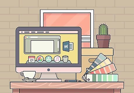
Choose a final aesthetic for your magazine. How your magazine looks will define its brand almost as much as the content itself. Consider: The font: Are you using fonts inside the magazine that are easy to read and fit with your theme? Do they call back to the font you used for your magazine's title, on the cover? The paper: Are you going to print your magazine on glossy or matte paper? The color: Some magazines, such as People, used to be half color, half black and white to save on ink costs. Many literary magazines are printed in black and white, though most mainstream titles have moved to color. Consider what you can afford to spend on ink per issue, and how you can incorporate that into your magazine's look and feel.
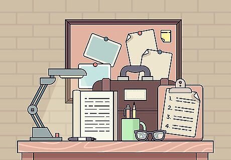
Decide how to order your content. How you organize your content inside the magazine dictates how the reader will flip through it. Here are some basic guidelines: Usually the table of contents goes first. If your magazine has many ads, there can be several pages of them before the table of contents. A colophon follows the table of contents. The colophon should list the title, the volume and issue of the magazine (both will be 1 if this is the first), the place of publication, and the personnel who worked on it (such as editors, writers and photographers). Order your articles so that the main piece is somewhere in the middle, or even toward the back. Consider doing a whimsical "back page". Many magazines, such as TIME or Vanity Fair use the last page of the magazine for fun, skimmable content, such as an engaging infographic or a silly interview.
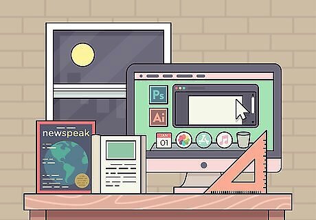
Produce the layout of your magazine. Once you know where you're going to put your content, it's time to lay it out. Exactly how you choose to do this will depend on what software you decide to use (or not), but there are certain elements to remember: Keep your formatting consistent. Use the same borders, styles, numbering, and font or fonts throughout; the last thing you want is to create a Frankenzine that looks patched together by twelve different people. Number your pages, especially if you've provided a table of contents. Make sure your final product is even-numbered (counting the cover). If you try to make an odd-numbered magazine, you'll have at least one blank page. If you're making your magazine by hand, now is the time to figure out how you'll transfer your content to the page. Will you print it out? Write it directly onto the pages? Paste on photos?
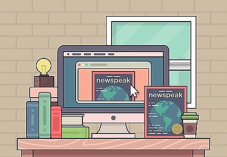
Publish your magazine. You can do this the old-fashioned way by having it printed, or you can publish it online. Research your options to see what makes the most sense for your budget. Bind your magazine (handmade only). When your pages are finished, you can bind the magazine so it will stay together. Consider some of the steps in Make a Homemade Book.



Comments
0 comment