
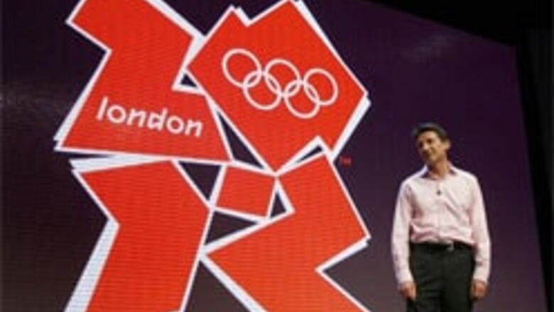
New Delhi: London unveiled the logo for the 2012 Olympics on Monday. The logo has four jigsaw-like pieces forming the number 2012 and comes in a range of colours from hot pink to electric blue.
The logo was launched by the chairman of the organising committee and winner of four Olympic medals Sebastian Coe.
But it's already facing a tirade of criticism with some designers describing the logo as messy and dated.
London's Design Museum founder and cultural commentator, Stephen Bayley, described it as: "a puerile mess, an artistic flop and a commercial scandal."
In a stark departure from logos at previous games, there is no visual imagery of the host city or country.
The logo has the word "london" spelled out in lower case letters in the top left half, with the Olympic rings in white in the top right half.
"It's vital that we reach out to those young people in a language that they understand and in technology that's familiar to them," London organising chief Sebastian Coe said. "This brand is absolutely the world they live in."
Coe said the logo, designed by international branding firm Wolff Olins, should not disfranchise older Olympic fans.
"People who understand the games, who get the games, have a historic feel for the games, have an emotional attachment to the games are probably not going to be moved, one way or another by a brand," he said.
The logo used during London's successful bid for the games featured a multicolored ribbon creating an outline of the River Thames woven through the word "London." The Athens logo in 2004 featured an olive wreath, while Sydney's 2000 logo featured a runner created by boomerangs. Beijing's 2008 logo features Chinese calligraphy of a runner.
Within hours of the launch, an online petition was set up asking for a new logo or a return to the bid design. By late Monday, the petition had received more than 5,500 signatures.
Blogs on newspaper websites for The Guardian, the Daily Telegraph, the British Broadcasting Corp. and Design Week magazine all contained negative comments on the design.
More than 80 per cent of respondents to a BBC online poll disapproved of the logo.
The 2012 Paralympics will share the same logo as the Olympic Games for the first time.
PAGE_BREAK
"The new emblem is dynamic, modern and flexible, reflecting a brand-savvy world where people, especially young people, no longer relate to static logos but respond to a dynamic brand that works with new technology and across traditional and new media networks," London 2012 organizers said in a statement.
International Olympic Committee president Jacques Rogge described the logo as "truly innovative."
"Each edition of the Olympic Games brings its own flavor and touch to what is now well over a century of modern Olympic history," Rogge said. "The brand launched today by London 2012 is, I believe, an early indication of the dynamism, modernity and inclusiveness with which London 2012 will leave its Olympic mark."
London 2012 chief executive Paul Deighton said it cost 400,000 pounds ($796,000) to design the logo. Consumer research conducted with the public and the IOC provided feedback that included the words "bright," "positive" and "energetic."
London organisers want the logo to be interactive, and have encouraged people to download the design template, personalize it and upload it onto the official Web site.
Deighton said the logo would evolve into a number of forms over the years.
Sponsors would be able to adapt the logo to suit them. Banking sponsor Lloyds began using the logo on Monday, with its own corporate colors of light blue and green, with the official partner description written diagonally across the bottom number two.
(With inputs from AP)


Comments
0 comment