views
Comparing Two Sets of Data on One Graph
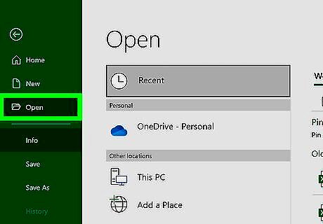
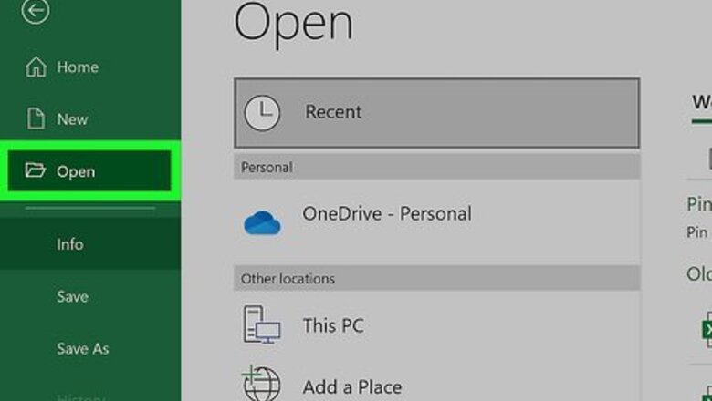
Open the sheet that contains your existing data. Use this method if you want to compare two sets of similar data on the same graph. For example, comparing sales for red t-shirts versus blue t-shirts in the same year. This method will create a second X and Y axis for the data you want to compare. If you want to combine a second data set with your existing data set rather than compare, see Adding More Data to a Graph on the Same Sheet or Adding More Data to Graph on a Different Sheet.
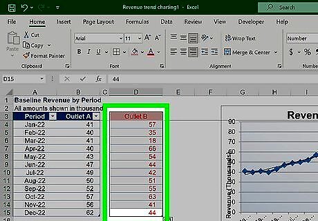
Add your new data in a separate column and/or row. If you haven't already done so, add the second set of data you want to compare to the first set somewhere on the same sheet as your existing data. The cells do not have to be adjacent.
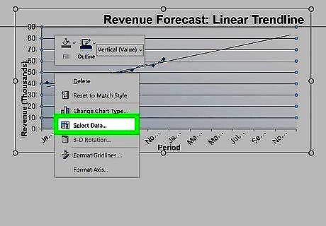
Right-click your chart and choose Select Data. This opens the Select Data Source dialog window. You can also click the graph once, select the Chart Design tab at the top, and then click Select Data on the toolbar at the top of Word.
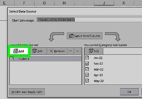
Click the Add button on the Select data Source window. You'll see it under the "Legend Entries (Series)" header.
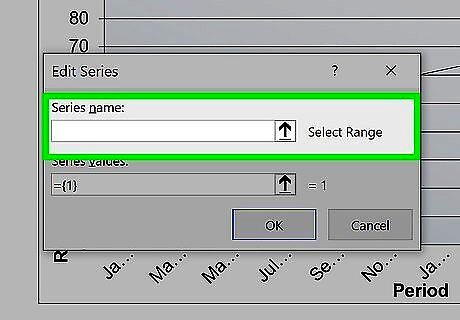
Type a name for this data range in the "Series name" field. This is how your data will appear on the graph and legend. You can also click a cell that contains the name you want to use for this range to make that cell's value the name of the series.
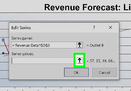
Click the "Series X values" field. This activates the field.
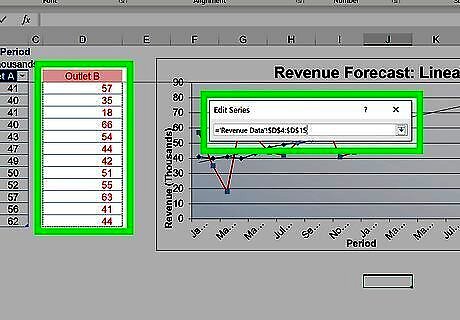
Use the mouse to select data for your second X axis. Once you lift your finger from the mouse, the range will appear in the "Series X values" field. For example, if a set of dates runs along the X axis of your original data, select the second set of dates for this X axis.
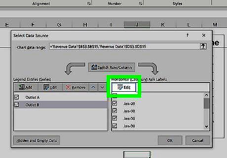
Click the "Series Y values" field. This activates the Y axis field.
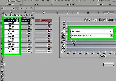
Select the data you want to use for your second Y axis. Use the mouse to highlight the new data you want to add to this second Y axis. If you see an error when trying to select a set of data, delete everything in the field and select that range again.
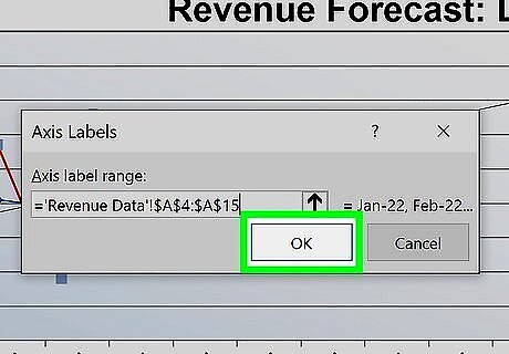
Click OK. Now you'll see two different sets of data under "Legend Entries (Series)".
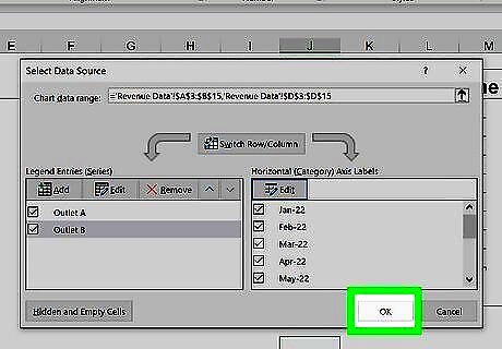
Click OK to display the comparison data. Your graph now displays a comparison of two sets of data on the same chart.
Adding More Data to a Graph on the Same Sheet

Open the sheet that contains your graph and data. Use this method if your graph and its existing data are on the same worksheet. This method will combine the second set of data with the original data on the existing axes.
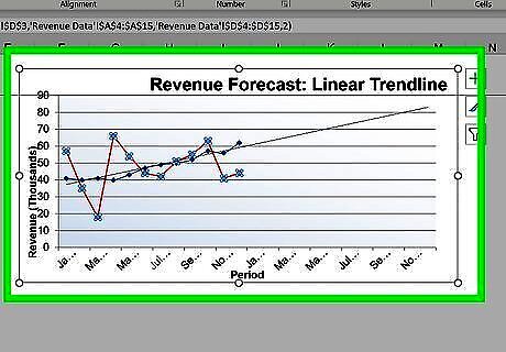
Click anywhere on the graph. When you click the graph, you'll see lines and sizing handles surrounding the data that's already included. The second series of data you've added is not yet highlighted.
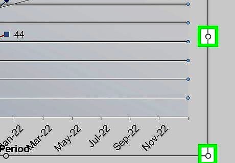
Drag the handles to select the new data. For example, if you added a new column of data to the right of the existing data, drag the rightmost handle to the right to include that column in the data selection range. The chart will update right away to reflect all of the data selected.
Adding More Data to Graph on a Different Sheet

Open the sheet that contains your existing data. Use this method if your graph and data are on separate sheets. This method will combine the second set of data with the original data on the existing axes.
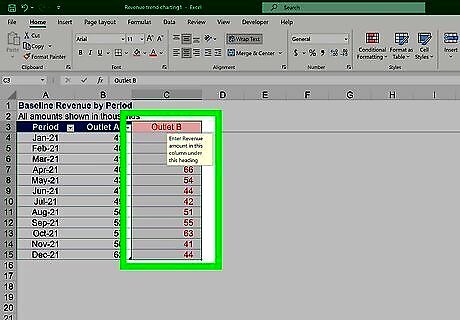
Enter the new data next to your current data. Type the new data for your graph into the cells directly next to or below your current data.
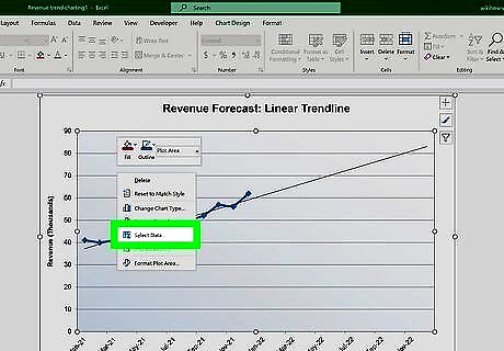
Right-click your graph and choose Select Data. This opens the Select Data Source dialog window. You can also click the graph once, select the Chart Design tab at the top, and then click Select Data on the toolbar at the top of Word.
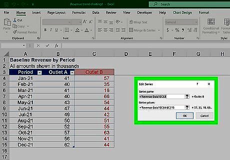
Select all of the data you want to add. Leaving the Select Data Source window open, use the mouse to highlight all of the data you want to include in your chart, including the existing data. Once you select some data, the series will appear under "Legend Entries (Series)" on the left side of the Select Data Source window.
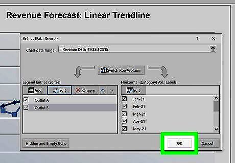
Click OK on the Select Data Source window. This closes the dialog window and adds the second data set to your chart.


Comments
0 comment